Summer Wedding Colors That Actually Look Good
Why Color Matters More Than You Think
A wedding color palette does more than make things look pretty. It sets the emotional tone of the entire day. Guests may not remember the exact shade of blue on your table linens, but they will remember whether the space felt warm and inviting or cool and elegant. Color is the first impression your wedding makes before anyone says a word.
Summer gives you a natural advantage here. The season’s long daylight hours, warm air, and outdoor greenery create a backdrop that makes most palettes pop. But “most” is not “all.” Some combinations that look stunning in curated photos can fall flat in a sun-drenched courtyard or a city hall ceremony room with fluorescent lighting.
The key is picking colors that work with your venue, your personal style, and the realities of a summer day. These twelve palettes are worth considering, whether you are planning a full outdoor reception or a simple courthouse ceremony.
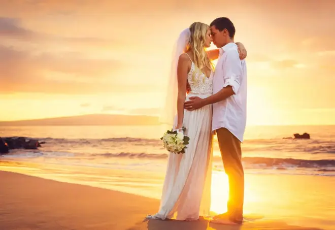
Blue and White: The Classic That Earns Its Reputation
White belongs at weddings. That is not a controversial statement. But pairing it with blue creates something more interesting than either color alone. The combination feels crisp and fresh, like linen on a warm afternoon.
Different shades of blue shift the entire mood. Navy leans formal and works well for courthouse ceremonies where the space itself is grand. Cornflower blue feels lighter and more playful, perfect for outdoor celebrations. Dusty blue sits somewhere in between, offering a muted sophistication that works year-round.
For a city hall wedding, blue and white also happens to be practical. These colors photograph well under almost any lighting, and they complement the neutral stone and marble found in most government buildings.
White, Green, and Pink: Softness With Structure
This trio works because each color has a clear role. White anchors the palette. Pink adds warmth and romance. Green connects everything to the natural world, whether that means potted ferns on a windowsill or a full garden reception.
The real benefit of this combination is how easy it is to source. Almost every florist can build arrangements in these tones without special orders. Roses, peonies, ranunculus, eucalyptus, and ferns all fall naturally into this palette. That keeps costs manageable and reduces the chance of last-minute substitutions throwing off your look.
If you are planning a reception after your courthouse wedding, this palette transitions well from a simple ceremony space to a restaurant or backyard dinner.
Sourcing Tip for Seasonal Flowers
Ask your florist which blooms are in peak season during your wedding month. In-season flowers like garden roses (June), dahlias (August), and zinnias (July) cost less and look fresher than out-of-season imports.
Violet as a Standalone Statement
Violet is one of the few colors confident enough to carry an entire wedding on its own. It reads as elegant without being stuffy, and it has enough depth to avoid looking monotone when you layer different shades together.
A palette built around violet might include lavender for table settings, deep plum for bridesmaids’ dresses, and soft lilac for invitation accents. The range within this single color family is wide enough to create visual interest without adding a second hue.
Violet also pairs naturally with summer greenery. If your ceremony or reception includes any outdoor elements, the surrounding foliage acts as a built-in complement that balances the richness of the purple tones.
Orange and Blue: Unexpected but Effective
This pairing surprises people because orange and blue sit on opposite ends of the color wheel. That contrast is exactly what makes it work. Blue cools down the warmth of orange, and orange prevents blue from feeling cold or sterile.
The trick is to avoid using both at full saturation. Burnt orange with slate blue feels sophisticated. Tangerine with royal blue feels like a sports team uniform. Intensity matters.
Consider using one color as the dominant tone and the other as an accent. A mostly blue palette with pops of orange in the flowers, napkins, or groom’s suit creates a cohesive look without overwhelming the eye.
Rainbow: More Is More (When Done Right)
A multi-color palette works for summer weddings because the season itself is colorful. Blooming gardens, farmer’s market produce, sunset skies: summer already looks like a rainbow if you pay attention.
The secret to pulling this off without chaos is choosing pastel or muted versions of each color. Soft peach, dusty rose, sage, butter yellow, and powder blue all belong together when their saturation levels match. It is the tonal consistency, not the number of colors, that makes a rainbow scheme feel intentional rather than scattered.
This approach works especially well for couples who want a less traditional celebration. It gives you freedom with decor and attire while still looking coordinated in photos.
Yellow and Green: Sunshine Meets the Outdoors
Yellow and green is an underrated combination that feels immediately summery. Deep forest green paired with a warm, golden yellow creates something that looks organic, like sunlight filtering through trees.
This palette shines at outdoor venues and garden ceremonies. If your wedding happens near any kind of greenery (a park, a botanical garden, even a city sidewalk lined with trees), the natural surroundings do half the decorating for you.
For indoor city hall ceremonies, yellow and green bring life into spaces that can sometimes feel overly formal. A bouquet of sunflowers and greenery, yellow candles on the signing table, or green ribbon on ceremony programs can make a government building feel personal.
Peach With a Neutral Accent
Peach captures the warmth of summer without the intensity of orange or the sweetness of pink. It sits in a comfortable middle ground that feels grown-up and approachable.
Pair it with cream, taupe, or soft gray for a palette that looks effortlessly polished. These neutral tones let peach remain the star without competing for attention.
Peach also flatters a wide range of skin tones, which makes it a considerate choice for bridesmaids’ dresses and a practical choice for couples who want their wedding party to genuinely enjoy wearing what they are asked to wear.
Black and Pastel: The Sophisticated Contrast
Black at a summer wedding sounds counterintuitive, but it works as an anchor for pastel tones. Think of it as the frame around a painting. Black chairs, black table runners, or black accents in the stationery give soft colors like blush, mint, and lavender something to stand against.
This combination is particularly well-suited to city hall and courthouse weddings. The architectural formality of these spaces matches black’s elegance, while pastels keep the palette from feeling too severe for a summer celebration.
One practical note: if your ceremony is outdoors in direct sunlight, limit black to accents rather than large surface areas. Comfort matters as much as aesthetics on a hot day. For the full picture on keeping guests and the wedding party comfortable in warm weather, see these summer wedding comfort tips.
Venue Lighting Changes Everything
Before committing to your palette, visit your venue at the same time of day as your ceremony. Colors look different under natural light, fluorescent fixtures, and warm indoor lighting. Bring fabric swatches or paper samples to test in the actual space.
Cinnamon, White, and Blush
Cinnamon is a richer, more complex alternative to the standard “fall rust” that shows up in every wedding magazine. It has depth and warmth without feeling heavy, and it pairs beautifully with lighter tones.
White balances the intensity of cinnamon, while blush creates a bridge between the two. The result is a palette that feels romantic and warm, perfect for late-summer weddings when the light starts turning golden in the evenings.
This combination also works well for couples who want warm tones without committing fully to an autumn aesthetic. It sits right on the line between summer and fall, making it ideal for August and early September ceremonies.
Sage and Gray: The Modern Neutral
Sage green has been gaining popularity for good reason. It is calming, natural, and versatile enough to work in almost any setting. Paired with gray, it creates a modern, understated palette that photographs beautifully.
This combination works across a wide range of formality levels. Sage and charcoal gray feel polished enough for a black-tie reception. Sage and light gray feel relaxed enough for a backyard dinner.
For couples focused on setting a reasonable wedding budget, sage and gray also happen to be easy colors to source in decor and attire. You will not need custom-dyed anything to make this palette work.
Terracotta: Earthy and Warm
Terracotta works as a summer color because it mirrors the warmth of the season without relying on brightness. It is grounded and earthy, with a richness that adds personality to any venue.
This shade pairs well with cream, white, dried grasses, and natural wood tones. It fits desert-inspired aesthetics as comfortably as it fits a minimalist city hall ceremony.
Terracotta also ages well in photographs. While trendy neons and ultra-bright palettes can look dated quickly, earthy tones tend to hold up over time. Your wedding photos will still feel current a decade from now, which matters more than most couples realize when choosing colors.
Teal: Bold Without Being Loud
Teal brings energy to a wedding palette without tipping into overwhelming territory. It is bolder than baby blue but calmer than turquoise, sitting in a sweet spot that feels both fresh and grounded.
This color works especially well near water or in venues with large windows. Natural light brings out the green undertones in teal, making it appear richer and more dimensional than it looks under artificial lighting.
For the ceremony itself, teal accents in a bridal bouquet, a pocket square, or table centerpieces add a distinctive touch. Teal pairs well with metallics like gold and copper, giving you options for detail work that feels intentional and special.
How to Match Your Palette to Your Venue
Your color palette should reflect three things: the season, your venue, and your personality. Summer gives you permission to go bright, but it does not require it. Muted tones, neutrals, and unexpected combinations all work when they feel intentional.
Start by considering your ceremony space. If you are getting married at city hall, look at the existing colors of the building. Stone, marble, wood paneling, and painted walls all influence which palettes will look best in that specific room.
Think about how your colors will appear in wedding photos and on your wedding invitations. The palette that excites you when you picture it across all these elements is probably the right one. Trust that instinct, pick your colors, and let the summer light do the rest.
The 60-30-10 Rule for Wedding Colors
Use your dominant color for 60% of the decor (linens, large florals, backdrop), your secondary color for 30% (bridesmaids' dresses, napkins, accent pieces), and your accent color for 10% (boutonnieres, cake details, place cards). This ratio creates visual balance and prevents any single color from overwhelming the space.